8 Ways to Love Your Small Space More
When we run stories on living in homes with petite proportions, you often tell us, "Small? You should see my house!" Because we aim to please, we've rounded up some of the tiniest rooms on Houzz, picking those that pack plenty of ideas and function into a small space. We think that these are indisputably compact. But, more important, do you?
Pack it in
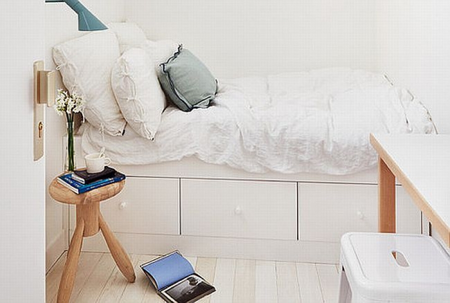
This bedroom may be minute, but it is perfectly formed. Rather than conventionally putting the headboard on the back wall, the owners found just enough space to turn it so that the side of the bed runs along the back wall.
This could look cramped and messy but instead looks airy and designed. Here's why.
- Crumpled bed linen allows the bed not to be made perfectly (which can be a pain when a bed is surrounded on three sides) but still looks clean, stylish and, especially, cozy and inviting.
- Deep storage drawers beneath the bed take the place of bulky furniture elsewhere.
- An almost one-color palette - the drawers are the same pale color as the bed and walls, and the floor is pale too - banishes harsh boundary lines and visually expands the space.
- A wall light is nearly always the best solution for teeny spaces, since it frees up surface area that might otherwise house a table lamp.
The high shelf enhances the feeling that the room is bigger than it is, especially since its use is decorative and not functional. Why? If a room appears to have space to use shelves purely for display, it simply feels as though it must have the space to do so - a little brain trick! Choose light or transparent objects, which won't visually fill up the room, or get designer-y if you're so inclined and display paperbacks with their spines facing inward to add texture, but not color.
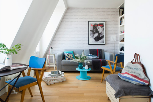 Photo by Bambu/Olivier Bourdon – Discover living room design ideas
Scale your furniture
This wee living room, which flows into a small dining space, shown in the foreground, has lots of smart tips to pick up.
Furniture is scaled down, so as to give the room the impression of being bigger than it is and to avoid overcrowding. Take the spool coffee table: Not only is it low and compact, but it's also circular, often a wise shape in small spaces since curves can intrude less into a space than corners.
The side table next to the petite sofa and the armchair are interesting choices too, as each is designed to let light through them, meaning they don't block space and light.
Incorporating up-and-over storage, which makes use of otherwise unused areas above a door frame and high-up wall space, is an absolute winner of a way to pack more into a little space without making it feel cramped.
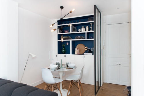 Photo by Stephan Bidoux Studio – Discover dining room design ideas
Divide and conquer
Picture, for a moment, walking into this studio apartment before that shelving unit had been built and before the glass screen went up. You'd risk feeling as if you'd arrived home and straight into the dining table. Subtle and interesting divisions of space — especially those that don't close it off, as shown here - are your friends.
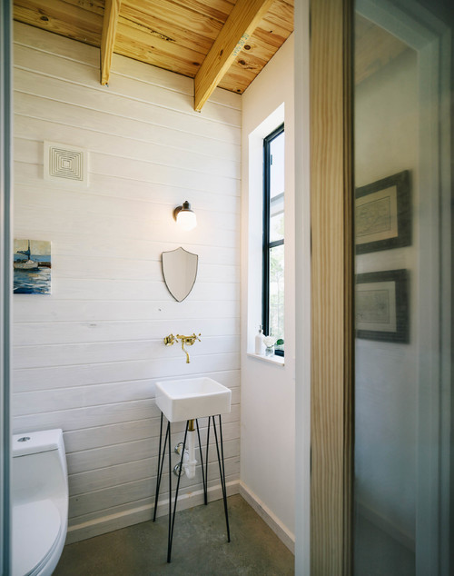 Photo by PAVONETTI Office of Design – Look for bathroom pictures
Highlight cuteness
This teeny sink could get swallowed by a vanity, but with the hairpin legs, its petite proportions are really highlighted. The legs also make it look more elegant and important. As already discussed, something may be small, but if you make it really special, no one will be thinking about whether it's big enough. Instead, they'll just be admiring it, as hopefully you will also do daily. Distraction as a tool should not be underestimated!
Another great idea here is to have wall-mounted faucets when you have to have a smaller-than-average sink — the last thing you want is deck-mounted ones impinging on the little space you have. Act out washing your face exuberantly before you buy -- if none of the water has a chance of going back into the sink, think again. Or design a wet room around it where it won't matter.
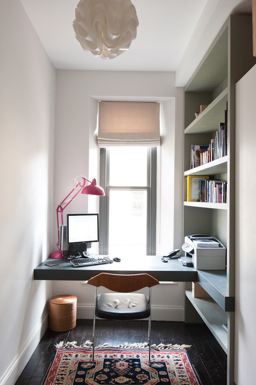 Photo by Moon Design + Build – More home office photos
Go custom
This little home office is clever on several fronts. First off, rather than feeling thwarted by that low, skinny window, the owners simply worked around it. The desk cuts through it, but by painting the desktop and the window frame the same color, the two features work with rather than against each other.
Investing in custom design for a space that needs to be functional is also a good tip to take from here: Just look at how much storage has been packed in and at how deep the desk is. It looks so obvious when you see it now, but the secret of good design is that it's so often deceptively simple.
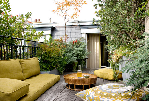 Photo by Nicolas Matheus Photographe – Look for deck pictures
Lie low
This rooftop garden plays with proportions. Opting for furniture that's low to the floor gives an impression of more head height. It's a trick that works more obviously in rooms with low ceilings, but you can see how effective it is at also making this area feel like a welcoming lounging spot.
Another tip to take away is not to scrimp on planting. You may think that crowding the space with greenery will shrink it. In fact, doing so is likely to make you feel as though you're in a lush, extravagant secret garden. But do choose plants that are easy to prune and handle, and that have soft foliage you can brush past without ducking, diving and contorting.
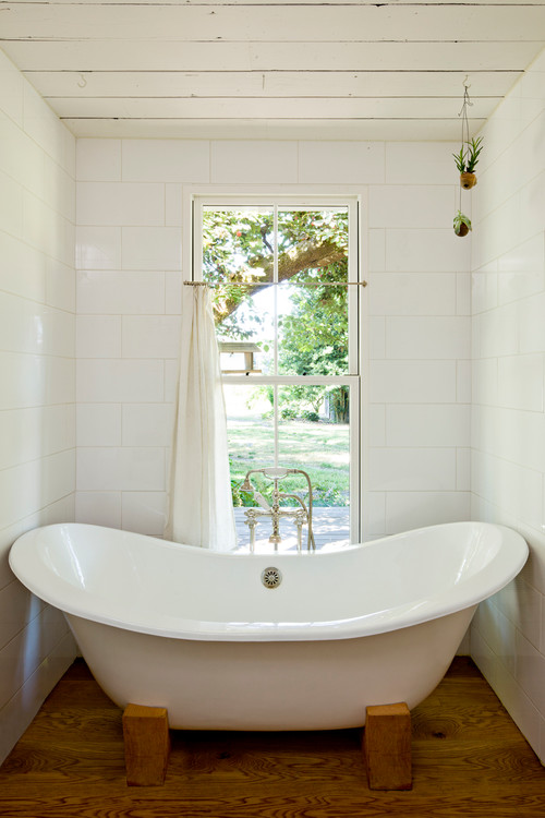 Photo by Jessic Helgerson Interior Design – Look for bathroom pictures
Ignore convention
No space for that statement slipper or roll-top tub? Are you sure? Of course, having wall space on both sides would be more conventional, as would generally putting a fancy bath in a more generously sized room, but a small bathroom hasn't stopped these homeowners from going big on their bathing spot. And what better way to make the most of a lush view like that?
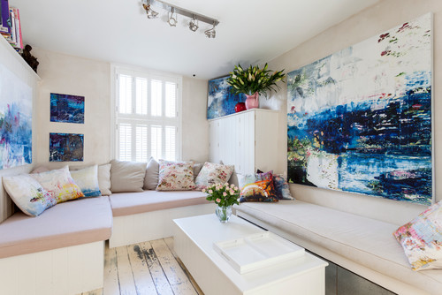 Photo by Chris Snook – More living room photos
Build your own sofas
When you can't find the right sofa for a very small living room, consider copying this idea. The homeowner had her own bench seating built around the room, and beneath the cushions, she's bagged loads of extra storage to boot.
Ensure that you design benches to be deep enough for slouchy TV-watching comfort, and invest in good-quality, thick cushions, which you can get made at a foam-cutting shop. This is furniture you'll spend a lot of time on, so before you go ahead, make it your mission to seek out and try out every bench seat in your area - in cafes, friends' homes, shops - so you can figure out what you do and don't like.
Want to estimate your home improvement costs before talking with a contractor? Claim your home for free with bluehammer to estimate costs, secure your home inventory and learn more about your home.
* THIS REPORT IS AN OPINION THAT MAY BE INACCURATE AND IS PROVIDED SOLELY AS AN INFORMATIONAL TOOL NOT DESIGNED TO PROVIDE DEFINITIVE ANSWERS. ALL ELEMENTS ARE OFFERED "AS IS" AND BLUEBOOK EXPRESSLY DISCLAIM ANY AND ALL WARRANTIES, REPRESENTATIONS, AND GUARANTEES OF ANY NATURE, EXPRESS, IMPLIED OR OTHERWISE, INCLUDING BUT NOT LIMITED TO ANY IMPLIED WARRANTIES OF MERCHANTABLITILY, NONINFRINGEMENT, TITLE, QUIET ENJOYMENT, ACCURACY, OR FITNESS FOR A PARTICULAR PURPOSE. IN NO EVENT SHALL BLUEBOOK (OR THEIR SUPPLIERS) BE LIABLE FOR ANY GENERAL, DIRECT, SPECIAL, INCIDENTAL, INDIRECT OR CONSEQUENTIAL DAMAGES OF ANY KIND, OR ANY DAMAGES WHATSOEVER (INCLUDING WITHOUT LIMITATION, THOSE RESULTING FROM USE OF THE PRODUCT, INCLUDING : (1) RELIANCE ON THE MATERIALS PRESENTED, (2) COSTS OF REPLACEMENT GOODS, (3) LOSS OF USE, DATA OR PROFITS, (4) DELAYS OR BUSINESS INTERRUPTIONS, (5) AND ANY THEORY OF LIABILITY, ARISING OUT OF OR IN CONNECTION WITH THE USE OR PERFORMANCE OF INFORMATION) WHETHER OR NOT BLUEBOOK HAS BEEN ADVISED OF THE POSSIBILITY OF SUCH DAMAGES.